Condominium living has a lot of advantages: 24/7 security, convenient location, and oftentimes the use of outstanding facilities. On top of these, getting a condo unit is a great real estate investment that you can benefit from in the future. This is why more and more people are choosing to live in condos as it caters to every lifestyle.
With all the perks comes a teeny downside. Living in a condo literally means you have limited space. Still, there’s no need to stress. We’re here to give you tips on how to make your unit look much cozier with the help of some condominium interior design magic. Featuring our own project, a two-bedroom condominium in Baron Tower, San Juan City, let’s get you acquainted with some key steps on achieving more with less.
1. Opt For A Light Monochrome Theme
The basic rule of thumb for small spaces is adopting a light monochromatic theme for its interior design. You will be able to observe in the pictures throughout the article how the continuous white-colored ceiling, walls, and floors made every room brighter and appear bigger.
2. Use More Mirrors
Mirrors are wondrous. They can be handy tools to trick the eyes into believing that you have a bigger space.
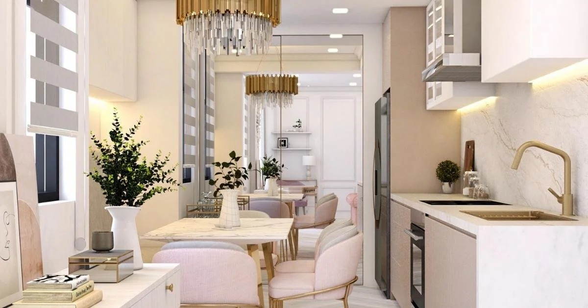
As seen in this condo unit at Baron Tower, mirrors were strategically used in the entire wall adjacent to the dining area as it shares an open floor plan with the living room. The illusion of a bigger space is critical for this small, shared space.
Expansive mirrors were also utilized in the cabinet doors in both bedrooms. In this case, the floor-to-ceiling mirrors serve double purposes: for visual trickery and outfit changes!
3. Incorporate Good Lighting
Another basic interior design trick here (that’s far too common in homes in the Philippines) is mixing natural light with great artificial lighting. The reason for this hack is to illuminate the space and make it airy. Install thin curtains over your thick tapestries so that sunlight will come through your windows. Light up every hallway and install task lighting (i.e. under kitchen cupboards, in open shelves, and vanity mirrors) to brighten up every surface.
4. Choose High-shine Or Transparent Materials
Gloss-finished materials work like mirrors in that they reflect light, making any room appear larger. Aside from this purpose, however, furniture with this kind of finish also plays well as a decorative element, so there will be no need to add clutter.
This interior design element is observed in the dining set of our two-bedroom condo unit, as well as in the brass-and-silver chandelier above said dining set.
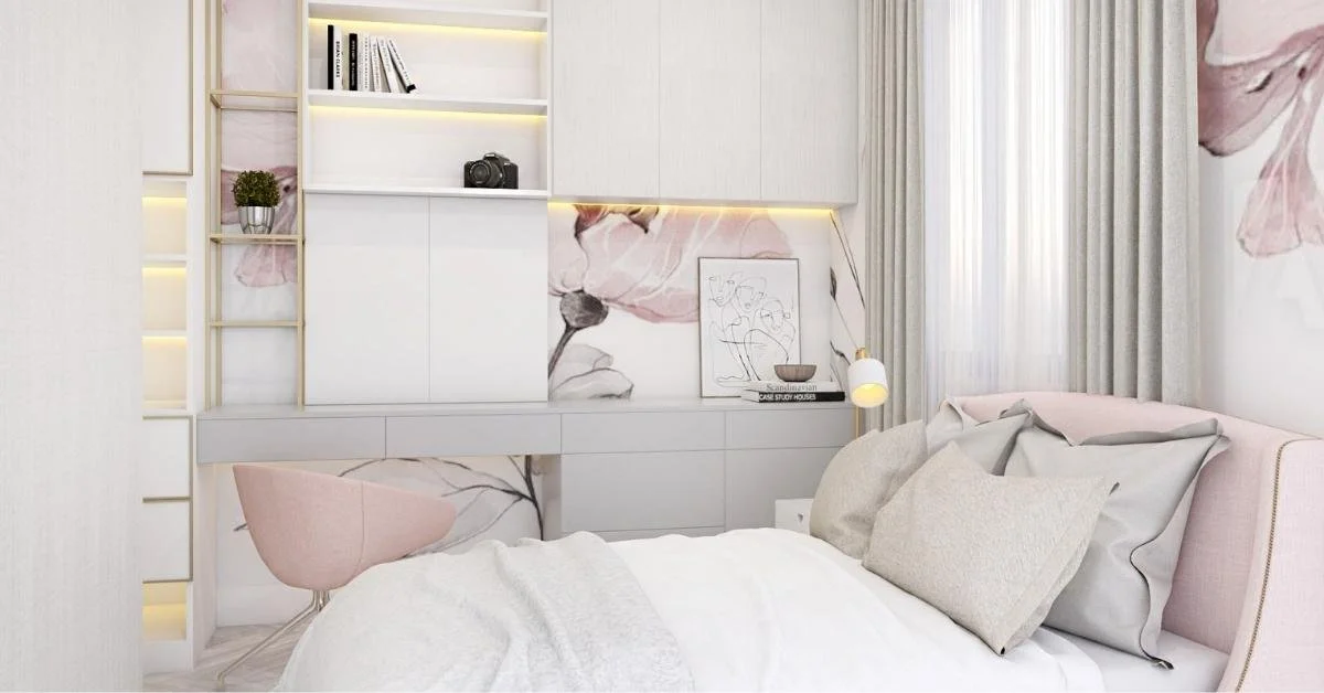
Transparent materials, on the other hand, do not provide a visual block. See here how the desk chair in the master’s bedroom looks almost invisible.
5. Be Smart About Your Furniture Choices
You don’t have to put multiple small pieces of furniture to add seating areas. All you need is one big piece of furniture that won’t eat up a lot of floor space.
Take our good ol’ model for size: In the Baron Tower unit, a built-in bench seat was added for more seating capacity and less floor space occupancy. Putting an adequate-sized ottoman against the wall in the living area was a smarter call than potentially squeezing in another couch that would have just created a visual block.
In the bedrooms, the queen-sized beds dominate the space—and rightly so—because it is in proportion with the size of the room.
6. Maximize Vertical Spaces
Condos have more walls than floor space, so it’s only smart to utilize this in so many ways. Install floor-to-ceiling open shelves for storage, but make sure not to fill them all up because it will defeat the purpose of decluttering. Also, it’s best to mount your TV instead of adding a console table to put it on.
Consider a wall desk like the Baron Tower unit’s first bedroom to fully maximize the utilization of the walls and minimize the use of floor space.
7. Make Every Corner Count
Since you don’t have much space to begin with, make sure that every corner is designed for a specific purpose. The corner of this living room was turned into a workstation with the perfect background for video conferences.
8. Work With Odd Angles
Don’t leave odd angles empty; instead, make them work in your favor. As seen in this bedroom: Instead of leaving an awkwardly blank space between the walls partially covered by the foot of the bed, we turned it into a shelving space for personal items.
9. Enlist the help of IEO
If you’re still struggling with all the clutter from living with a very limited condo space, it’s a smart move to get help from experts who know their stuff. We can help you whip up a condominium interior design that should maximize your space—and hopefully optimize your way of living.
IEO Interior Design & Construction is regarded as one of the best interior designers in the Philippines for our luxurious design with a purpose. Let us help you solve your condo living problems! Book a quick 15-minute consultation with us.


